A good vignette looks effortless. It is rarely accidental. The small arrangement on a console, bedside table, bookshelf, or bar cart works because the pieces relate to one another in scale, color, texture, and light. When those four ideas are balanced, even a handful of objects can make the whole room feel more finished.
The best place to begin is not with “What should I buy?” but with “What is missing from this composition?” That question keeps styling useful rather than decorative for decoration’s sake.
1. SCALE: GIVE THE EYE SOMEWHERE TO GO
If every object is the same height, the arrangement becomes a line. Create a high point, a middle point, and a low point. A taller vessel might establish height, a decorative box can sit at the middle level, and a low bowl or tray can anchor the base. The exact pieces matter less than the hierarchy.
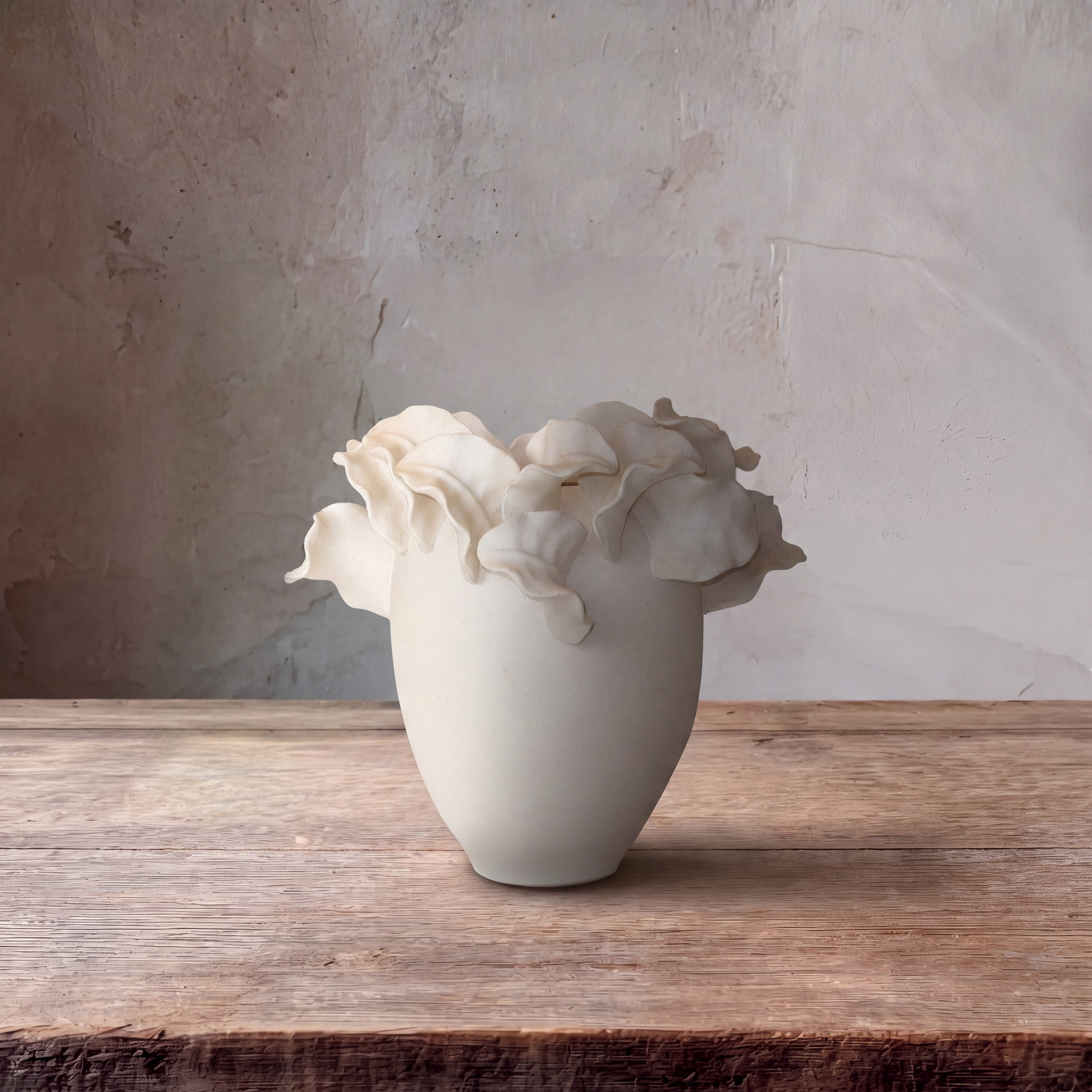
For example, a vignette could begin with The Folded White Vessel, add The Coral Marble Box, and finish with a low natural accent. The shapes are different enough to be interesting, but restrained enough to live together.
2. COLOR: REPEAT, DO NOT MATCH
Matching every object usually makes a vignette look purchased all at once. Repeating a color is more natural. A blue glass vase can connect visually to a blue-and-white cachepot without being identical. A white ceramic piece can echo a pale candle or orchid. The eye recognizes the relationship without feeling that the pieces were sold as a set.
3. TEXTURE: MIX SURFACES
A composition made entirely of smooth materials tends to feel flat. Introduce one contrasting surface: woven fiber, stone, preserved moss, matte ceramic, or textured glass. The Woven Gallery Trays are useful for this because they add texture and also create a boundary around smaller pieces. A tray says, visually, “these objects belong together.”
4. LIGHT: THINK ABOUT WHAT CATCHES IT
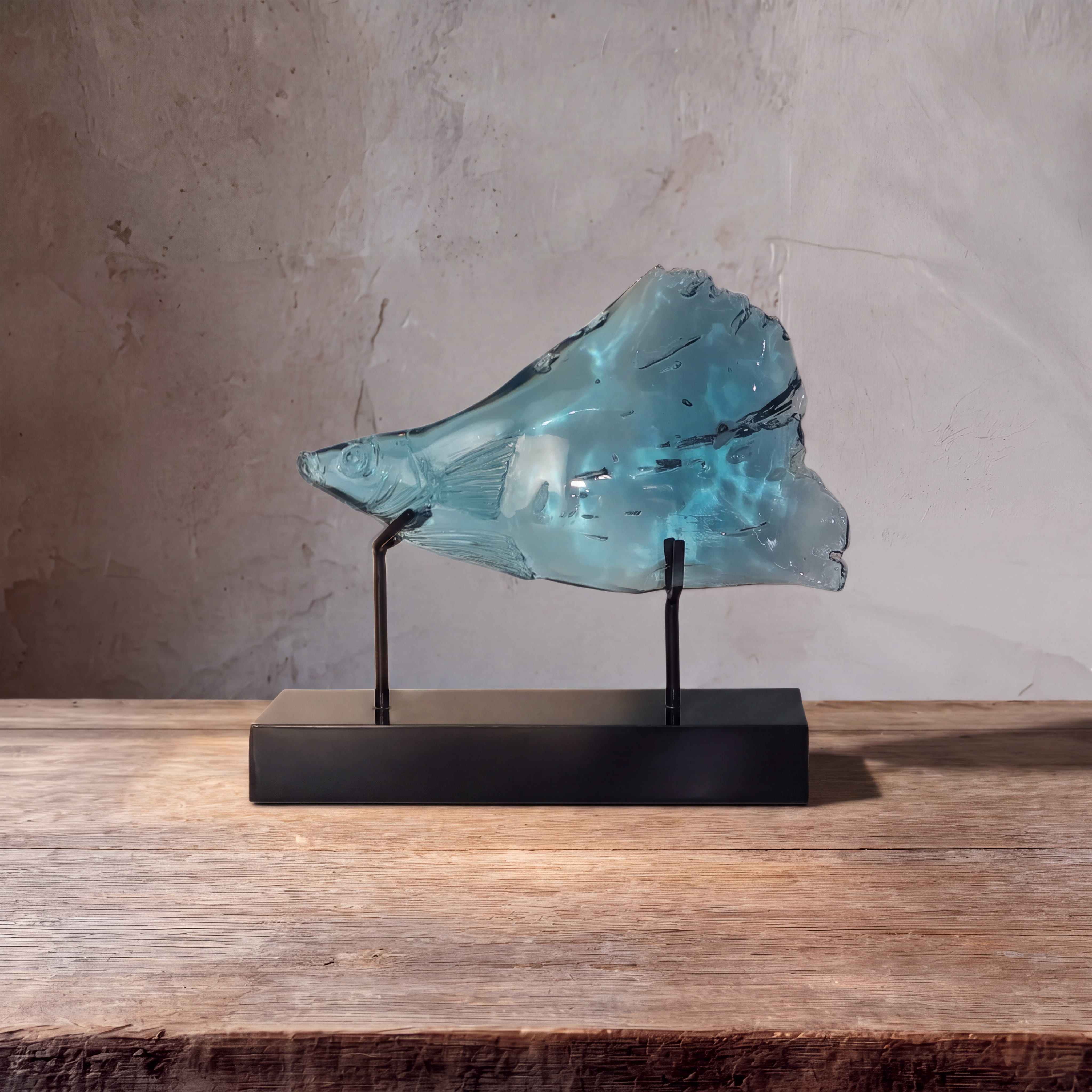
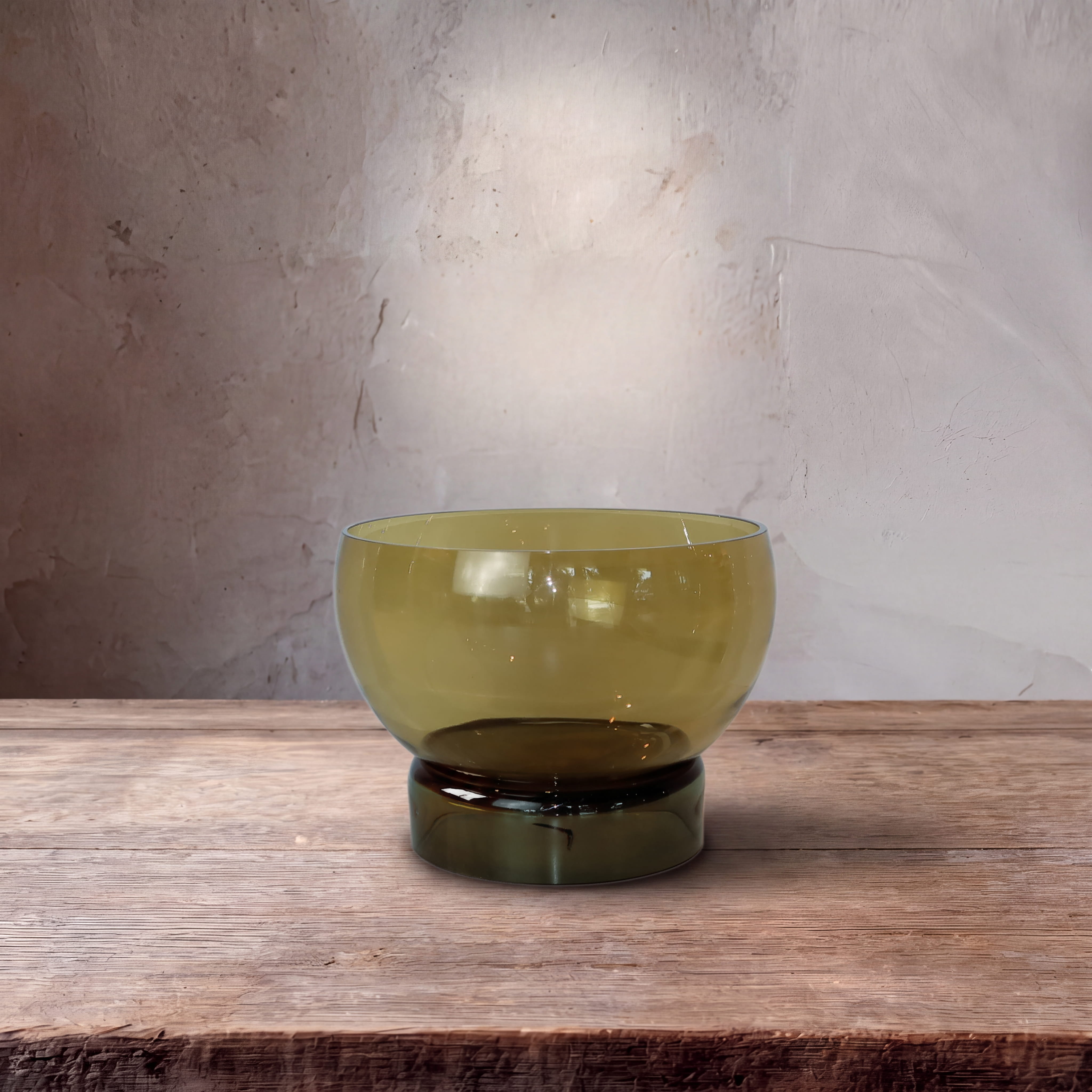
Clear glass, opal glass, polished stone, and pale ceramics behave differently throughout the day. A Ripple Glass Pitcher on a bar cart can catch light and feel almost sculptural when it is not in use. An opal-glass candle creates a softer glow. A matte-white bowl absorbs light and gives the eye somewhere calm to rest.
5. SPACE: LEAVE SOMETHING OUT
The final step is usually subtraction. If every inch of a surface is styled, nothing feels important. Let the edge of a table remain empty. Give a sculptural object a little air. If two small pieces compete, remove one. Good styling has pauses.
A simple test is to stand back and squint. You should see a clear overall shape rather than a collection of unrelated objects. Then take a phone photo. Images reveal crowded spots, awkward spacing, and competing heights remarkably well.
This is how we think about styling at Studio Home: not as filling a surface, but as composing one. Scale gives structure. Color creates connection. Texture adds depth. Light changes the mood. Space makes the entire thing feel intentional.